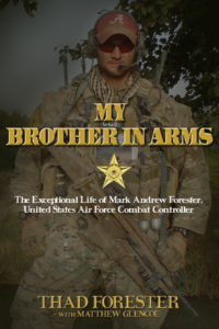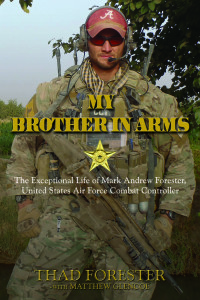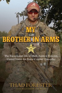


What value can you put on the cover of a book? Should you use an image or text only? These are a few of the thoughts I had in the early stages of writing Mark’s book. Since Triumph Press allowed me to have final say, I had to come up with the best book cover—at least in mine and my publisher’s opinion.
My initial thoughts were to have an image of Mark smiling, non-military. After all, he was only in the military for three years and his life represented more than that. Plus, I wanted people to see the real side of him, not just the seemingly rough, warrior image.
On the other hand, he was a warrior—a special operator in a small, elite group, and people needed to see the men protecting us: He who stands ready to destroy the enemy. What would catch people’s interest; his life before the military or him facing the enemy and being shot down while moving forward?
At Mark’s memorial walk in May 2013, at about mile 17, I was talking with his good friend Bobby about this. Bobby said, “You’ve got to use the warrior picture.” After I thought about it and talked about with Melanie at Triumph Press, I was on board.
I was reading Eric Blehm’s book “Fearless” during a period of writing Mark’s book and envisioned Mark’s cover being similar to it—a subdued, darkened image that covered most of the front. Early prints of the book were an attempt at that, but still far from looking like “Fearless”. However, I’m happy with how the image looks and is placed on the cover.
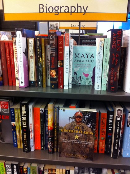
The text size is questionable. With some market feedback, it was determined that the title didn’t stand out—especially when on a bookshelf with only the spine showing. I saw this first hand at a friend’s. So, as of May, we brightened up the title color and changed the font slightly.
There are some beliefs that the book title should be legible from 10 feet away. Mine is borderline too small. However, I wanted the text Brother in Arms all on one line. I also wanted the CCT from Mark’s patch to be seen.
As for the star; that’s actually the Silver Star Medal, without the ribbon. I asked some trusted people in the AFSOC if it was appropriate to use the star without it’s ribbon. They confirmed they thought it was alright. This allowed me to reference Mark’s Silver Star (third-highest military decoration for valor in combat against enemy of the US) to all who see the book.
Next up was the finish—matte or glossy. Even though initially I wanted matte, we have glossy. This was due to poor samples from printer.
I believe the cover to Mark’s book will be viewed as extreme by some. There are those who will be uninterested b/c of the hard-core military cover. Then, others will be drawn to it. It does a great job showing the multitude of equipment he wore and how he still supported the Tide. I still think the cover is the main reason Costco hasn’t agreed to accept in their stores yet. Trust me, this doesn’t break my heart.
I’m not sure who took this pic in September 2010, but in my family’s eyes, it’s iconic and timeless. I think it was one of his terps, but if anyone knows, please contact me. This pic is also a key reference for equipment to a 1/6 scaled warrior for a company designing a figure of Mark that will be produced and sold beginning in spring 2017. More info on that later.


